When you go paddling, hiking or skiing next year, which colors will you prefer to wear—electric blue, navy, chartreuse, turquoise or pink? To a novice scanning the blur of rainbow shades on the color wheel of outerwear and midlayers, it seems like only a wizard can predict.
In fact, for leading outdoor apparel companies like Arc’teryx, Patagonia, The North Face and REI, color planning is a sophisticated process that takes months of time and teams of experts in design, social trends and fabrics. The decisions—from choices of zippers and hood trims to exteriors and liners—can make or break the success of a clothing line.
Color is the first thing people notice in a garment or product, says Amanda Russell, a senior color designer at REI. “An intriguing color can draw someone to look more closely at a product that they weren’t initially considering,” Russell says. “Strategically placed color can guide usage and highlight features, which is an important consideration for many of the products we work on.”
Color designers juggle a lot of considerations, including a product’s visibility, fashion, function, prestige and empowerment factors, according to Larissa Kozlowski, a senior color designer at Arc’teryx. “To get a color palette right, you need to find the right balance of progressive and timeless colors—a mixture of values to add depth and richness with darks, and excitement and energy with brights,” says Kozlowski.

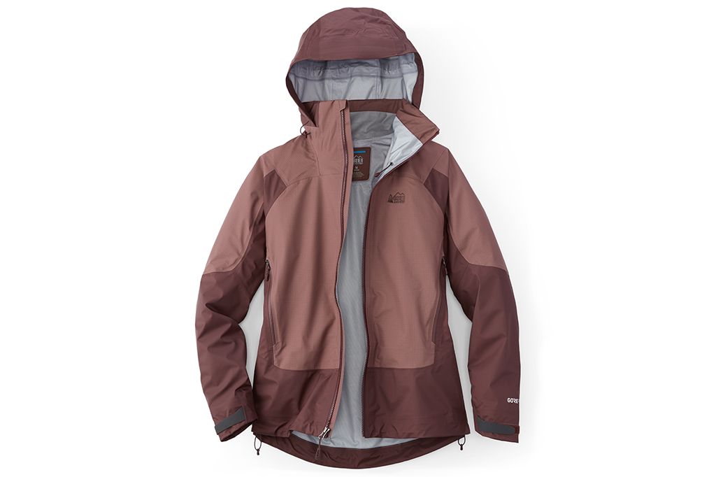
The color of this REI Co-op Stormbolt GTX jacket? Peppercorn, handpicked for you by a team of color experts.
Development time lengths and methods vary across companies. At REI, producing the “peppercorn” color—a tawny mauve hue featured in the Stormbolt GTX jacket—took roughly a two-year period of research and development. For Russell, the choice neatly blends desires for intrigue with needs for functionality.
“The color is nuanced and sophisticated,” Russell says. “The macro trend reflected the relevance of earthy mineral tones. Placing this color in a technical Gore-Tex® jacket felt like a fresh and sophisticated paring. If you look at the other colors offered in this style, there is also bright poppy red and black, which give us an overall balance.”
At REI, as well as at Arc’teryx and other outdoor apparel companies, knowing the customers’ outdoor needs is key. Will kayakers be paddling on calm lakes or raging rivers? Will skiers be tackling steeps in the Tetons or glades in the Green Mountains? Will hikers travel through the rainy Pacific Northwest or the dry Sierra Nevada? “We think about the end use, as well as what the customer is expecting out of the product,” Russell says. “As a co-op with a wide range of members, our philosophy is to be ‘for all.’”
Color relates to personal preferences, as well. “Once you have a direction of who you are designing for, then you can begin to build your palette,” Kozlowski says. “Color application is all a matter of balance and harmony, and the same three colors paired together in one garment could be [unappealing] to some but used in a different application could also be a unique and fresh combination.”

Outerwear designers at Flylow pick the perfect shade for next year’s jackets. Photo Credit: Megan Michelson.
Foreshadowing trends is critical. Apparel companies work with trend forecasters like WGSN and Première Vision, companies that survey fashion observers worldwide to identify colors emerging at the forefront of style.
“We do a significant amount of in-house color trend research at the macro level to make educated predictions,” says Julia Burns, a senior color designer at REI along with Russell. They also look at runway analysis and research in the areas of art, interiors, architecture and automotive.
Finally, there’s the unique character and needs of the brand. REI has an especially wide circle of products to manage, from technical outerwear to kids’ apparel, to tents and bikes, says Burns. “These products have varying life cycles,” Burns says. “The equation we use to arrive at the perfect color can vary greatly between products, and requires a flexible and sometimes complex approach. It’s our job to continually evolve REI’s color perspective with a forward-looking approach, while always maintaining our brand’s DNA.”
